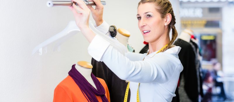
There’s nothing more welcoming than a clean building, polished fixtures, and great outfit right when you walk into a store.
When 90 percent of the brain is visual, it’s no wonder retail has its sights set on great merchandising.
Encourage customers to enjoy their shopping experience and increase sales with these five visual merchandising tips.
1. Use the Space Around the Display
It all starts with powerful store displays. An inspiring outfit that’s well-tailored on the mannequin encourages shoppers to stop and look.
While it may begin with the mannequin and eye-catching outfit, the entire department is an opportunity. Consider your floor layout. Is your store using the space to encourage customers to pick several pieces?
One of the most underutilized fixtures in the store is gondola shelves. Gondola shelves may be bulky, but they can be customized with gondola shelving parts to make the most of their space.
Use gondola shelves beside a powerful merchandising wall display to create more outfits and opportunities. For example, perhaps the mannequin is sporting a gorgeous blouse and pant combo. Use the gondola shelves to display nice shorts that may also pair nicely with the blouse. Vice versa, you can display more casual tops to go with the pants.
2. The Magic Number 3
Three is the magic number when it comes to visual merchandising. Beyond the obvious aesthetic advantage, displaying in three’s gives merchandisers the opportunity to play with asymmetry.
Asymmetry has a subconscious effect on our attention span. You may notice in your own shopping excursions that you tend to stop in front of displays with a tall mannequin with two shorter ones on either side.
This is not designed without cause. Asymmetry actually draws our eyes and attention in. Our brain naturally enjoys symmetry, so when something disrupts uniformed lines, we’re immediately honed in.
Use our predisposition for symmetry to your advantage. Play with heights and display clothing with asymmetry and the number three in mind.
3. Use Light to Tell a Story
Light does more than bring out the details of a piece of clothing or accessory. Particular lighting can affect our mood and perception.
Believe it or not, retail lighting can actually be used to encourage sales. How? By creating an atmosphere.
For example, certain fixtures look better in a certain light, backlighting can give products a luxurious look, and ambient lighting can encourage shoppers to walk a little slower and enjoy the experience.
4. Incorporate Price Points
Instead of hiding the price, try incorporating price points into the product display.
Price points are not a bad thing. In fact, it’s usually what the customer is looking for. Display deals near the front door to entice shoppers into the department. Use visual merchandising tactics to highlight the prices and work them into a table, wall, and fixture displays.
Even a high-ticket item should have the price front and center. After all, it’s not like you’ll be able to keep it a secret.
5. Alternate & Experiment
What works well in one section of the store may work in another department. Feel free to experiment, see what works and what doesn’t.
If you make an obvious change, write it down so you can revisit it later. Track sales and customer activity in that particular area to measure results.
Don’t forget that merchandising is an opportunity to use creativity to encourage sales.
Retail and Visual Merchandising
Managing a retail store is hard work and sometimes your visual merchandising team could use a helping hand.
Find a company that can help you redesign your store to make displaying items even easier. Choose from dozens of local, commercial contractors by using our easy, online search feature.

